

4 SEO Basics Every Small Business Should Know About In 2017

As a small business owner, SEO probably isn’t something that gets you excited to drive to the office every morning. However, that doesn’t mean it’s not important. If you want to remain competitive in 2017, it’s imperative that you focus on the basics.
Four SEO Concepts To Focus On
There’s a lot of noise in the SEO world right now. Everyone has their own opinions regarding what works. There are also plenty of predictions in regards to what will happen in the coming years and which practices will become obsolete.
SEO has always been a bit like the Wild West in that we’re still very much in the beginning stages of the industry. Plus, secret algorithms make it difficult for anyone to really know what the best strategy is.
“SEO can get technical, but it doesn’t have to be,” WPBeginner notes. However, “Just learning a few basic SEO tips to optimize your site can give you a noticeable boost in your website traffic.” Help your business move forward in 2017 by focusing on these foundational concepts:
1. White Hat Link Building
No matter what anyone tells you, link building is not dead. In fact, it’s hard to imagine an internet ecosystem where link building will ever be dead. So what is everyone crying about? In most cases, you’ll discover that the people complaining about the decay of link building are the same ones who were using black hat techniques to weave their webs of links.
While black hat link building is dead, white hat link building will remain important in 2017 and well beyond. You’d do well to pour even more energy into this area and really focus on link relevancy above all else.
2. Sitemaps
If your website doesn’t already have a sitemap, now’s the time. By adding a sitemap – which is essentially a page listing that links to the other pages on your site – you make it easy and effortless for search engines to crawl your website. And, as you can guess, the fewer clicks needed to access a particular page, the better off you’ll be.
3. Keyword Research
“Only a few short years ago, all you needed to rank was to have some content on the page. It didn’t matter if the content read like it was written by a monkey playing Mad Libs, you were probably safe,” SEO expert Brock Murray admits.“That has slowly changed over the years as Google’s algorithms were adjusted to better account for the interests of searchers.”
Understanding this, it’s important that you don’t just perform basic-level keyword research and plug some high-ranking phrases into your website content. You need to conduct in-depth research and use semantic language that satisfies keyword requirements and keeps readers engaged when they’re on your site.
4. Satisfy User Intent
Contrary to popular belief, Google doesn’t just have one master algorithm. There are hundreds of individual algorithms in play and many are becoming increasingly reliant on artificial intelligence.
“So forget the algorithms,” says expert Tom Boland.“Stop trying to predict or understand the changes. Make content to satisfy user intent. Google is learning faster and faster how to determine exactly what your users are looking for. You should too.”
Build A Strong SEO Foundation
Before your business can worry about the intricacies of SEO or try newfangled strategies, you have to build a strong and stable foundation to fall back on. In 2017, make it a top priority to lay some sturdy cornerstones that will give you the strength needed to pursue other techniques down the road.
credit: orginal article

5 Social Media Studies That Will Boost Your Marketing Skills

To help you better understand the ever-changing social media landscape, check out these studies.
We are very grateful for all the research that has been done on social media.
Social media studies have given us great ideas to improve our social media marketing, helped us understand the psychology behind social media behaviors and made us better marketers.
To help you better understand the ever-changing social media landscape, we jumped into the latest social media research papers, hoping to discover some under-the-radar insights to help supercharge your social media marketing strategy.
In this post, I’d love to share what we discovered and bring you some insightful and surprising social media studies of 2016, sharing the key findings and actionable takeaways you can try today.

Web Design tips: optimizing digital experiences for human behavior

For User Experience Design That Delights, Put People First
In a world saturated with web and mobile apps, great user experience (UX) design remains scarce. Maybe that shouldn’t be a surprise. After all, optimizing digital experiences for human behavior is always a challenge.
As entrepreneurs or designers, it can be easy to fall into the trap of putting process over people. Designing in a black box, obsessively working to add functionalities or developing features without anchoring every decision to the needs of users are all common issues that come with this strategy. This tunnel vision often stems from having no clear product vision, too many stakeholders, or intense pressure to meet release deadlines.
To design products that solve problems instead of creating them, entrepreneurs and UX designers should keep a few tips top of mind.
Get Feedback First
Through a project’s life cycle, user experience designers need feedback from the people the product is meant to help. Surveys and market research will only go so far. You need to recruit and interview actual target users.
When you’re ready to build something, start with a prototype. This can be anything tangible that conveys the big idea behind your product. Tools like Invision and Proto.io let you create demos and get immediate audience feedback. Once you have a prototype, let users break it. Observe them testing out features. Ask questions. When they encounter a problem, you’ll know immediately, and you’ll be able to work on resolving it.
Don’t make assumptions about a user’s needs. Verify that the pain points your product addresses actually exist. When adding new features, confirm that these match up with people’s needs. Pushing out a bunch of notifications, for instance, may align with your business objectives, but those alerts might annoy users.
Plan Perfectly
Begin every project with the end in mind. Create a plan to get your product to market fast, and prioritize requirements, understanding that done is better than perfect. Make sure you have a launch plan. Know who your first users will be, and make it easy for them to share your product with your next wave of users.
Have a positioning plan. Understanding what differentiates your product can be a difference maker, and focusing on those elements during the design phase will lead to success.
Plan for your platform. If your goal is to release an app on Android and iOS, don’t expect the two versions to be identical. Think about the requirements of each operating system. Otherwise, you’ll have an app that probably doesn’t align with user expectations. As you plan, know when enough is enough. Cramming in additional features complicates the experience and can result in information overload for users, placing you back in the black box you’re climbing out of.
Develop a Product Persona
If your product were a person, whom would it resemble? Brainstorm the qualities your product would have, and make sure any product copy or messaging aligns with that persona. You’ll need to define a clear voice for your product to help users connect to it in a way that surprises and delights.
In many cases, your product is your brand. The way you talk about it should be consistent, both internally and externally. Your company may end up becoming like your product persona. That’s a good thing.
Great Design Keeps Moving
Accept that the first product won’t be perfect. In fact, it may never be perfect. That’s OK — design is iterative. Look forward to continuously improving on the basis of user feedback, and always be testing.
There’s no one formula for great user experience, but these best practices place people first, setting up your product for success. With design in mind, you’ll build an app people look forward to using.

Five Motivational Tips for Launching a Startup in 2017
Launching a startup is tricky business. There are few detailed roadmaps for how to do it successfully and most of the time it comes down to a good idea, a lot of hard work and a bit of luck. Not all startups are created equal.
But it’s not all just walking blindly in the dark without a guide. There are some things you can do and not do when launching a startup in 2017. Here is a list of five things to consider:
1. Just do it
As the part time philosopher and famous shoemaker once said – just do it. Begin. Whatever doubts you have, stop. Don’t worry about doing it perfectly from the beginning, or about making mistakes – you’re going to – so simply push them aside, don’t let them get in your way. Nothing comes from nothing. Register the domain. Write some code. Get your logo designed. Your willpower is an incredible asset – it’s like a force of nature.
So do it. Now. Just start. Why not?
2. Singular brand focus
Branding is crucial for any new business. You are your brand, and if it’s unclear to you what you are and who you are, then it will be unclear for everyone else too. Valentin Stalf, co-founder of the online-only bank N26, discusses their strategy here.
Essentially, they decided to build a mobile-first app, an app built with great design as the guiding principle. Rather than building something purely functional, and later asking the user to learn how to use their app because it has some potentially good features they might want to use, they built an app that people want to use – that people understand how to use right away. There was nothing accidental about it, their focus when developing the app was solely on making it a good experience for the end user and so far it’s succeeding for them.
What is your focus? What will you do that nobody else has thought of yet? What will you do that’s better than what’s currently available.
3. Don’t be afraid to ask questions
Reid Hoffman, the co-founder of LinkedIn coined the phrase (and later wrote a book about it) “live life in permanent beta.” This is an important message as it conveys one of the struggles encountered in every startup. It’s easy to become confident when things are going well, and it’s easy to find yourself looking internally rather than externally for answers to questions that arise.
You’re not going to know everything. Sometimes you’ll need the advice of experts. Just remember that it’s not a sign of weakness to ask questions, it’s a sign of strength – of knowing your limits. Just as it’s equally important to remember that there is no finish line. Your product will never be done. Keep working and keep asking questions.
Live your life in permanent beta.
4. Find funding from the right investors
It’s important to surround yourself with people who share your vision. This applies to employees and investors alike. It’s critical that your investors understand what it is you’re trying to achieve with the business, that they understand and trust your decisions even if the path forward isn’t always clear.
There are a few great options online to help you get started with finding the right people. Kabbage is one of the best options out there right now. It takes moments to apply and review your business performance. There are many options out there from companies like Square, with Square Capital or Fundbox. There have never been so many options available, and it’s key to get this partnership right if you want to grow your business the way you want.
5. Don’t lose your great company name
Registering your business name online is a snap with a multitude of online business registration sites. There’s no doubt that you should register your business name as soon as you know what it is, and it’s never been easier to do so.
Beyond losing your name to someone else, in most states, it’s the law. The exception to this is if you’re a sole proprietor or freelancer using your own name to conduct your business. John Doe, the freelance carpenter, doesn’t need to register if the business is solely in his name. Otherwise, it’s the law, as the public needs to know who is running the company.
With any online services, it’s easy to do. So don’t wait! Register your business today, and in 2017 you have one less thing to worry about on your path to conquering the world of business.
As 2017 is right around the corner, now is the time to get started with your company today! With a new administration coming, it’s a great chance to kick off your new idea!

5 Website Design Trends That Will Emerge In 2017

As always, the fonts must match the product, the brand and the target audience, and be web responsive to be effective.For non-website designers, it is nearly impossible to stay on top of the technological advances and countless new design options emerging almost daily. But you know that your website must be user-friendly and engaging on any device.
As a business owner in the digital marketing space, I often become the translator for designers and coders. Here are five of the most important website design trends to help you engage visitors and achieve your website conversion goals in 2017:
1) Responsive Website Design
Responsive website design is a requirement in today’s mobile society. Users may not know what it takes to make a website design responsive, but they know that without it, they will be looking elsewhere for answers, products or a viewing experience. In short, a mobile responsive website is one that is designed so that it looks the same when viewed on any device. A great source to view some prime examples of responsive website designs can be found at Awwwards.com; browse them and compare on different devices to see the unified effect.
2) Semi-Flat Design
Semi-flat design makes the elements appear as though they exist on a single surface. The widely-used design approach can bring clarity to the website for the viewer, while making transitions appear more unified. While it can be difficult to execute convincingly, when done correctly, semi-flat design makes it easier for website visitors to understand the cues and directions of the website. The result is a more intuitive navigation experience across the entire website.
Flat designs from a year or two ago had a lot of problems with their inability to draw users into the site and create a more immersive experience. This was because the images and characters were flat without any shading or differentiation, making it difficult for users to know where to click to navigate the websites. The discovery was chronicled in Windows 8 Usability Tests conducted by the Nielsen Norman Group.
Semi-flat designs overcome those challenges, and the use of the style in both Android’s and Apple’s software releases make it something that many mobile users are used to seeing.
3) Minimalism Paired With Micro-Interactions
It’s all about the mobile experience in 2017 and beyond. Micro-interactions are user enabled interactions that provide control, guidance or rewards, or just impart fun to the experience for the user. Minimalist design means web pages are uncluttered. By combining these semi-flat and minimalist design trends in 2017, websites can deliver great user experiences that take advantage of visitors’ short attention spans and need for instant gratification.
In the last two years, my firm began to discover that even though our clients’ websites had been optimized for mobile, we weren’t always seeing the bumps in conversions or longer visitor interactions that we expected. The biggest challenge was having too much content on the page. Best practice search engine optimization is in our blood, and having at least 200 words on each page tends to improve search engine results. But, in an era when people are looking for faster mobile interactions, users were getting frustrated navigating through too much content per page.
We adjusted by balancing snackable content on scrolling pages, and have seen great results.
4) Parallax Scrolling And Interactivity
Moving different parts of a website page at different speeds (parallax scrolling) is not new, but those who know how to use it innovatively reap the rewards of visitor engagement.
An example of using it innovatively would be applying it to interactive storytelling and interactive assessments. Each engages the user at a deeper level. We’ve all experienced websites with great parallax scrolling where the images and text are highly structured and fold on top of one another as we scroll down through or swipe across the page.
Parallax scrolling enables the user to have a one-touch scrolling experience that engages them, provides an interactive experience, and can tell a story through progressing content and images that they control. They can have the same experience on any device, which helps to enhance their experience as they learn about a brand, a product or a solution.
5) Stronger Use Of Typography
It seems we are always learning about effective fonts and using them in new ways with website design. One of the latest and most enduring trends is to blend fonts that work well together in a single page. This works with both different (but compatible) fonts as well as font sizes. As always, the fonts must match the product, th

Back to the basics: 10 expert tips for your startup's website
Back to the basics: 10 expert tips for your startup's website
A website is a startup's opportunity to distinguish itself from its competitors while also promoting its value and offerings to current and potential customers. An enticing home page with attention-grabbing visuals and a user-friendly interface is sure to boost engagement, but when you're in a rush to launch, crucial components can be easily overlooked. Unfortunately, the cost of ignoring the basics is high when it comes to converting customers.
To find out which elements are most important — from specific design elements to general principles — I asked 11 entrepreneurs from Young Entrepreneur Council (YEC) which must-have elements are critical for any startup to put front and center on their websites.

How to: Animate pop-up information panels with CSS

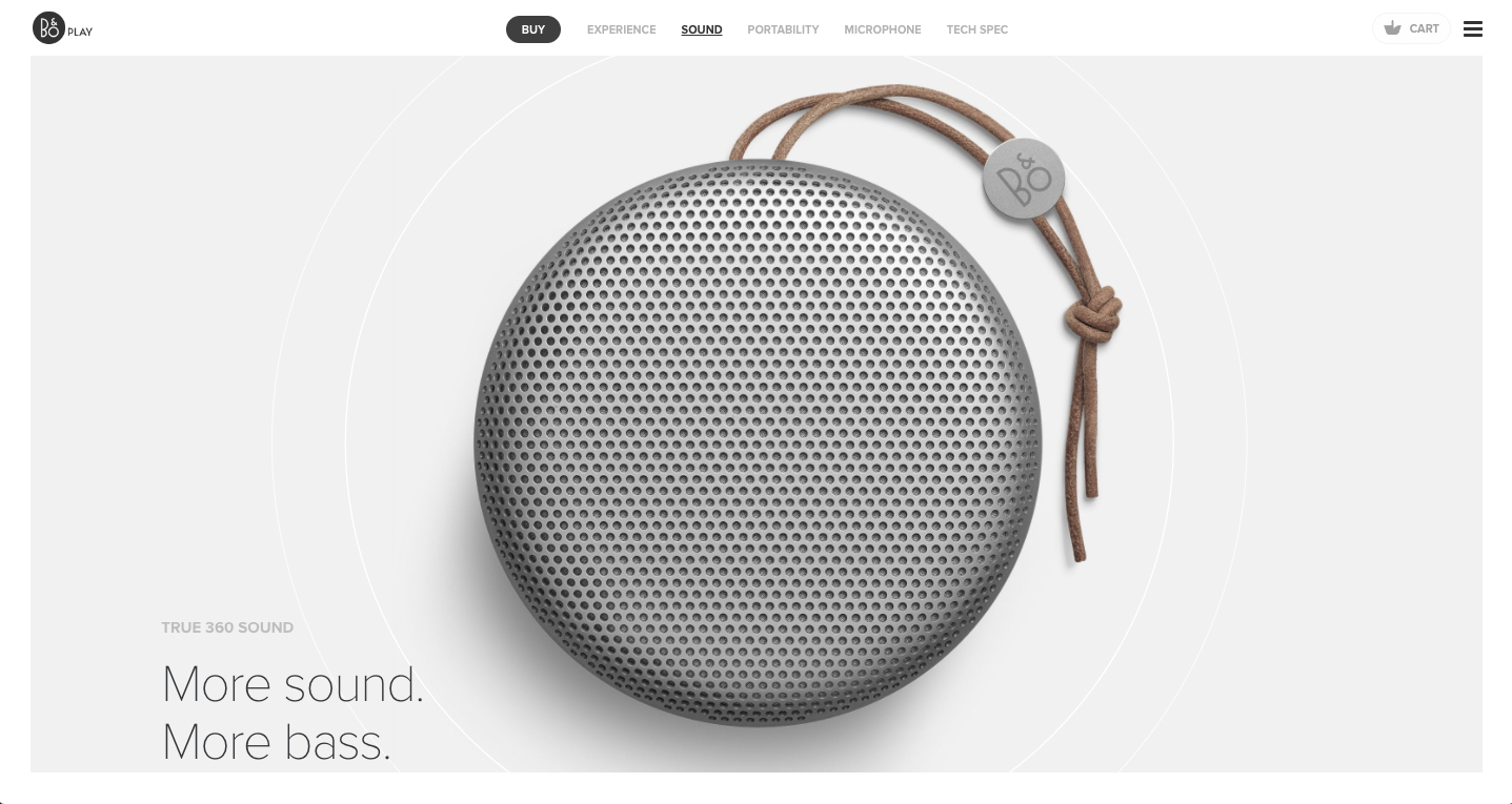
Bang & Olufsen are a well-established global brand leader in some of the very best products for sound quality. They’re also just as well known for the innovative styling of their products, and are an established company when it comes to innovative product design. With such a strong design ethos, the company offers collections of products that mirror that of the fashion world.
This website alone simply shows off just their headphones and speakers in their Autumn and Winter Collection for 2016. The products here have been inspired by the nature of the Icelandic geography, with earthy colours and textures used throughout their range. With such an emphasis within the company towards quality and styling, the web design has to mirror that same aspiration that Bang & Olufsen are known for. Fortunately, this is relatively easy to achieve with some outstanding product photography and videos, but the page design also has to make that quality shine through.
Using a minimal colour palette to emulate the colour of the products, there are a range of flourishes and animations that enable the site to stand out as an excellent piece of design. The photography reacts to the user so that they can explore the natural landscapes, and animated popovers appear to give more information and round out the content of the site. more

Quick Tips to wow your customers
Wow your customers with your first impression
Home pages with Benefits...
When potential clients land on our homepage what is your benefit or unique selling proposition that compels them to do business with you?
It's not only important to describe what you do, but also why what you do matters. Prospects want to know about the benefits of buying from you because that's what'll compel them to stick around.
Keep the copy lightweight and easy to read, and speak the language of your customers. Evernote (www,evernote.com) does a great job of listing features on their homepage in a way that's compelling, visually pleasing, and easy to understand.

Surcharge your website for online and instore sales with CTA
Your Call-to-Action (CTA) on your Website may make or break your business, here's why:
Netflix's CTA is so simple and easy that 10's of millions of users have acted on this CTA

What Is a Call-to-Action?
A call-to-action (usually abbreviated as CTA) is an image or line of text that prompts your visitors, leads, and customers to take action. It is, quite literally, a "call" to take an "action."
The action you want people to take could be anything: offer a discount at your store or on your services, learn about a new service, how their life can benefit from your product or service, download an ebook, sign up for a webinar, get a coupon, attend an event, etc. A CTA can be placed anywhere in your marketing -- on your website, at your retail store, print, tv or online advertising, in an ebook, in an email, or even at the end of a blog post.
Square gets right to the point......

The goal of your homepage is to compel visitors to dig deeper into your website and move them further down the funnel. Include two to three calls-to-action above the fold that direct people to different stages of the buying cycle -- and place them in spots that are easy to find.
These CTAs should be visually striking, ideally in a color that contrasts from the color scheme of your homepage, while still fitting in with the overall design. Keep the copy brief -- no more than five words -- and action-oriented, so it compels visitors to click whatever you're offering. Examples of CTA copy are "Sign up," "Make an appointment," or "Try it for free."
To optimize your CTAs for mobile users, make sure it's big enough to easily touch with a finger. If you're using a button, make it a minimum size of 44 px by 44 px so it's big enough for people to press with their finger. Consider adding whitespace around your CTA, too, so mobile visitors can easily tap it without accidentally clicking on something they didn't mean to.

Uber has a few great Primary CTAs on their homepage that are geared toward different personas: "Become a Driver" for potential drivers, and "Sign Up" for potential riders. Notice how starkly the bright blue CTAs contrast with the dark background.
Just remember...Your CTA is a call to the consumer on what action take, make sure it is the right one.

Web design so basic, yet many times overlooked….
web design tips so basic, many sites overlook the impact to their audience
#1: An Attention-Grabbing Headline.
The first thing people see when they visit your site should be a compelling headline that describes the most important benefit your product or service offers. The headline is the key element of your site. It's what will persuade visitors to stick around and check out what you have to offer.
Essential Element: Your headline should be well-written: It should be clear, concise and to the point. It should also be enticing-you want to pique your visitors' interest and make them eager to learn more about what you're selling. You can do this by emphasizing what your product or service can do for them.
Once you've crafted a compelling headline, format it so that it stands out from the rest of the text. It should be the first thing that catches your visitors' attention. Use a large font size, bolding, italics, a different color-whatever suits the style of your site.